Eddie Chacon is an LA based artist, working in music and photography. I found his work through the magazine, Human Being. His work stood out to me due to the strange and unsual approach to fashion photography and portraits. He uses a variety of light sources, some harsh flash using a flash gun and others with a more natural approach. He often makes studio set ups using creased bed sheets, which works in documenting a edgy kind of outcome, one that differs to many other fashion edits that are published in magazines. I like the realness of his work, the outcomes don’t look too staged and are a lot more authentic and relatable than many other photographers approach to fashion photography.
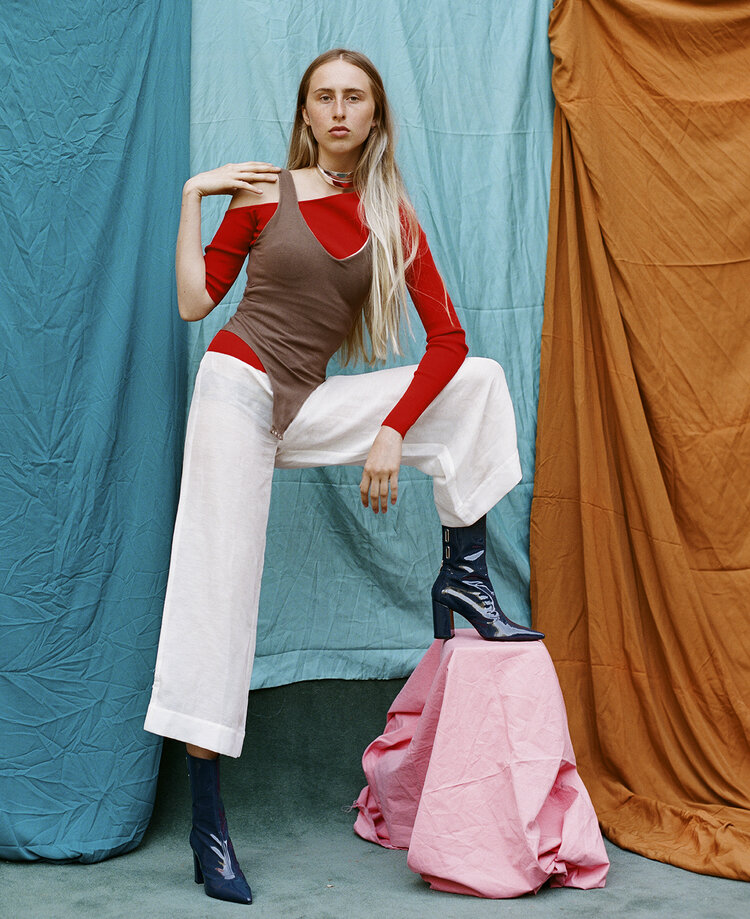
The image shows a model stood against a make shift studio. There are several creased sheets that make the backdrop, all of different colours. The unusualness of the studio works in showing an authetic and real scene. The model stands with one leg elevated as her foot rests on a block, again, covered by a coloured sheet. The image looks effortless with all aspects being easily achieved, yet difficult to re create without it looking messy. The model wears a bright red top, also being of a block colour. There are a lot of colours present in the scene, yet it still works, without it being chaotic. The pose of the model works really well and she fills enough of the frame so that she doesn’t get lost in the colourful background, she looks strong, but not over powering. The lighting looks quite soft and natural, but also consistent, potentially being from a soft box.
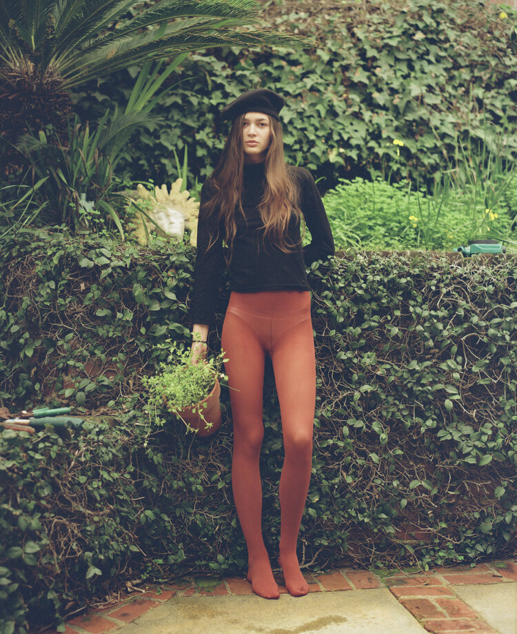
This image shows a model against a background of mixed green leaves. The whole image echos a natural and nature kind of feel, due to the soft colours and amount of plants present, surrounding the subject. Her orange tights make her pop from the background and stop her from being lost within the frame, yet her holding the pot, of similar colour, with a green plant relates her to the background and stops it from appearing odd and out of place. Using a prop within a shot can make an image work, which might not have as well without it. Her black hat and top stand out as a dark block colour, with the rest of the tones being quite soft, but still of colour. There doesn’t appear to be any obvious light source in addition to natural lighting. The image looks quite soft, yet strong in its presence.
Much like Chacon, I would like to use backgrounds as a way of bringing more depth to my work, planning a way of seperating the subject, but also bringing a relationship to give it purpose, perhaps through colours or props. In my work I would like the backgrounds to be purposful and not a distraction. I will also consider using props to benefit the scene, rather than take away from it.
