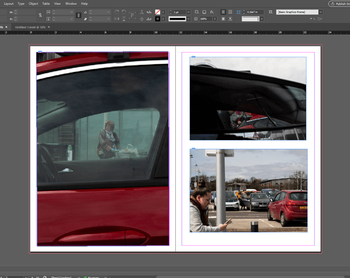
I experimented with this layout but later realised I didn’t leave enough room for text.
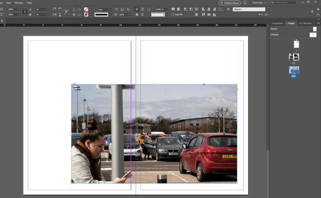
A double page spread with one image off centered is a common feature in my chosen magazine, National Geographic, so thought it would be good to trial it. I defineltey like the outcome and feel like it would work with text well.
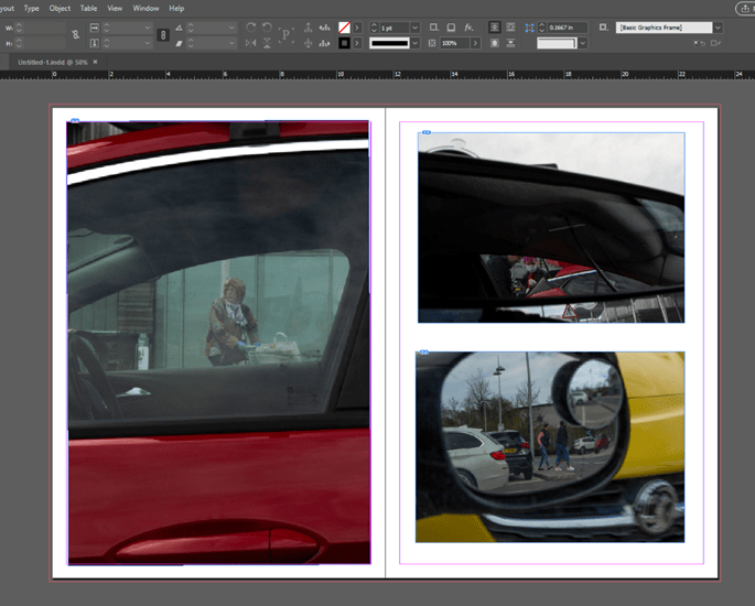
Again with this layout, I didn’t consider text very well. If I was to use this kind of layout I would have to make the images smaller. If it was smaller it could work well.
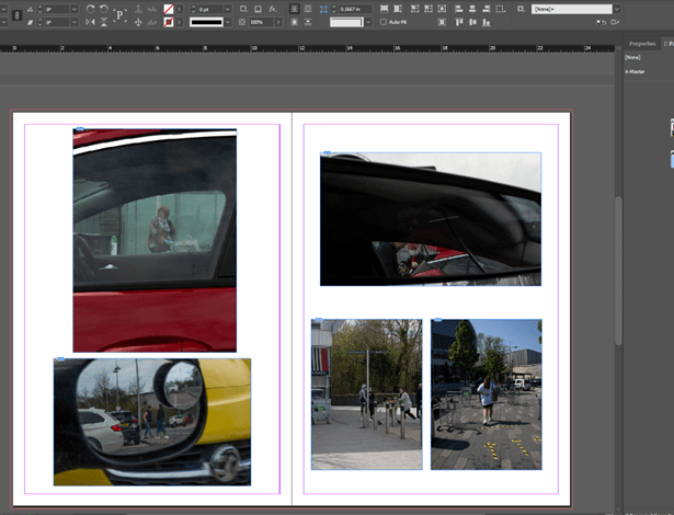
I decided to trial different images and like the way it looks more than the previous. The common theme of red works well and relates the pages together.
After experimenting with indesign for the first time, I am pleased with my, now better, understanding. After watching tutorials on how to use it I found my way around it a lot better. I definelty will experiment further before finalising my layout for submission.
